Social Impact Measurement Metrics for Businesses
Define metrics before data collection starts, and test them with real people first.

Every credible measurement system rests on three layers, and confusing them is where most reporting goes wrong.
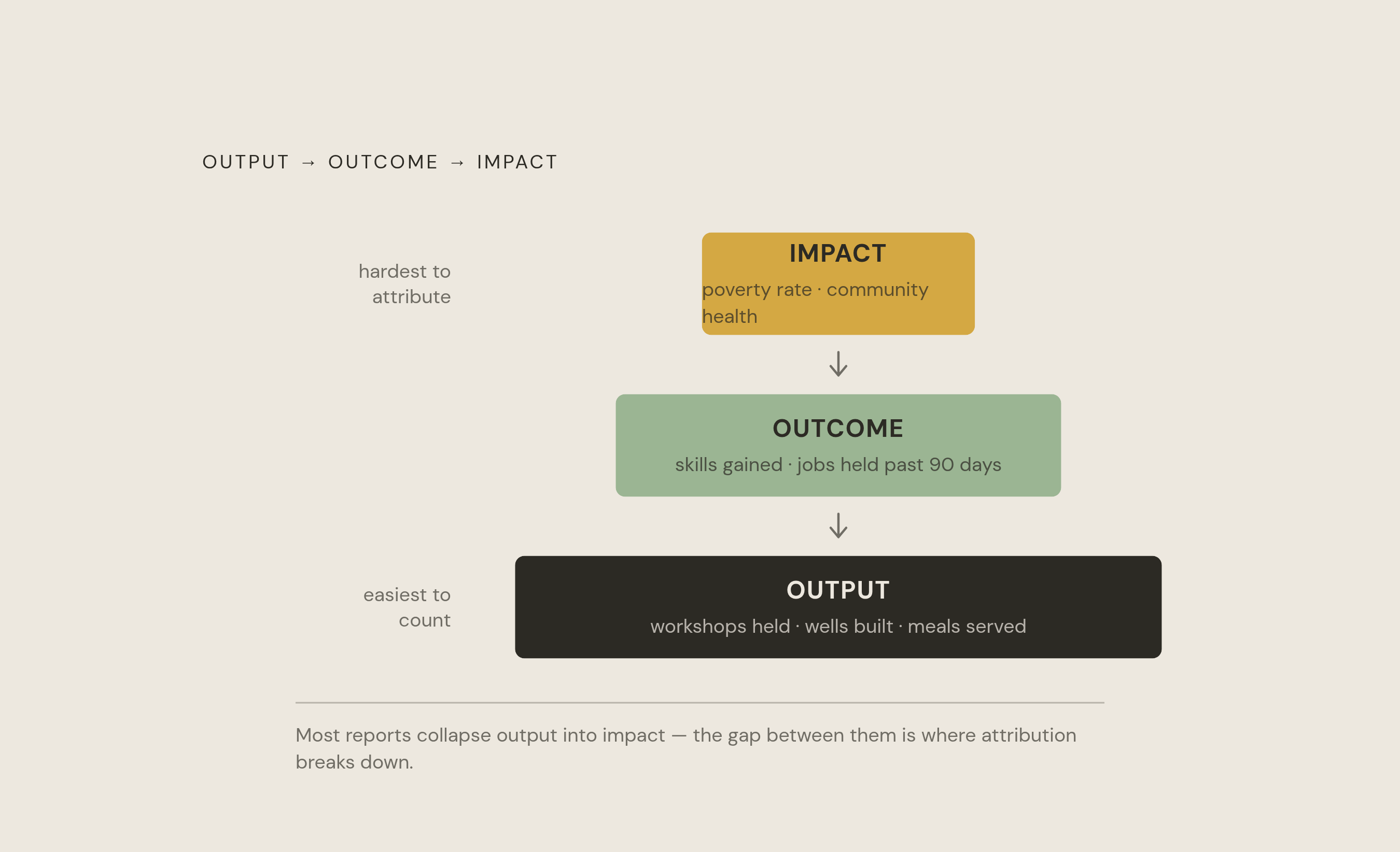
Output metrics describe what a program did: workshops held, wells built, meals served. They're concrete and easy to count, and they tell you nothing about whether anyone's life actually changed. Outcome metrics sit one level up: short- to medium-term shifts in the people a program touches, like increased knowledge, better health, a new skill, or a job that stuck past ninety days. An outcome metric only means something if it comes with a clear definition, a timing window, a named evidence source, and an honest account of its limits. Impact metrics go further still, pointing at long-term, systemic change (a lower regional poverty rate, measurably better community health), and they're the hardest of the three to pin on any single program.
A few other measure types round out a full picture, and they get dropped too often just to keep a dashboard tidy. Resource metrics track staff hours and organizational capacity. Quality and experience measures capture whether a service actually felt accessible or satisfying to the people using it. Distribution measures show whether participation differs meaningfully across groups. Unintended effects, burden, exclusion, adverse experiences, deserve a line item too, even when they complicate the story.
None of this establishes causation on its own, and the denominator changes everything. "Members engaged" means almost nothing until someone specifies whether engagement means opening an email, showing up to an event, or finishing a survey. Output data tells you who received a service. Outcome data tells you what happened to them, and a program that only tracks the first can't responsibly interpret its own results. Efficiency measures (cost per outcome achieved) and satisfaction measures (what beneficiaries actually say) close the loop. Skipping them is how a report ends up technically accurate and practically useless.
The indicator-metric-KPI distinction
Three words get used interchangeably in most impact reports, and that's exactly the problem. An indicator is the raw data point, such as a survey score, a job-placement count, or a revenue figure at six months. A metric is the rule that governs how that indicator gets collected, from whom, on what schedule, in what format, so the number means the same thing across cohorts and reporting periods. A KPI is a small, curated set of outcome metrics chosen because they tell you whether the program is on track. Keep that list to somewhere between three and seven, which is the advised range for a curated set of KPIs.
The single most common failure, and the one that wastes the most time, happens when teams skip straight to the report. They define their indicators while writing up results, months after the program ran, and end up with numbers that don't answer the question they set out to ask. By then it's too late to fix. The survey's already closed, the cohort's already moved on, and the team is left rationalizing whatever got collected.
Write the metric definition before a single data point gets collected, in full. A name alone, "job retention," isn't a definition. A real one specifies the population being measured, what counts as an observation, the numerator, the denominator, where the data comes from and when it's collected, the known limitations, and who owns it. If follow-up surveys only reach people who finished the program, the resulting outcome rate looks better than reality, because everyone who dropped out silently disappeared from the math. Skipping the denominator is how the whole thing falls apart, and enrollment coverage has to be reported on its own, next to the outcome, never folded into it.
Before rolling a metric out across every site, test it on one small cohort. Run the actual survey questions, do the calculation, look at the report the way a stakeholder would see it. That's where ambiguity gets caught, before it spreads into a dataset nobody wants to redo. Check relevance with the people the program actually serves, too, since a metric that's convenient to collect can still miss the change those people care about most.
Five dimensions for evaluating whether a metric is worth tracking
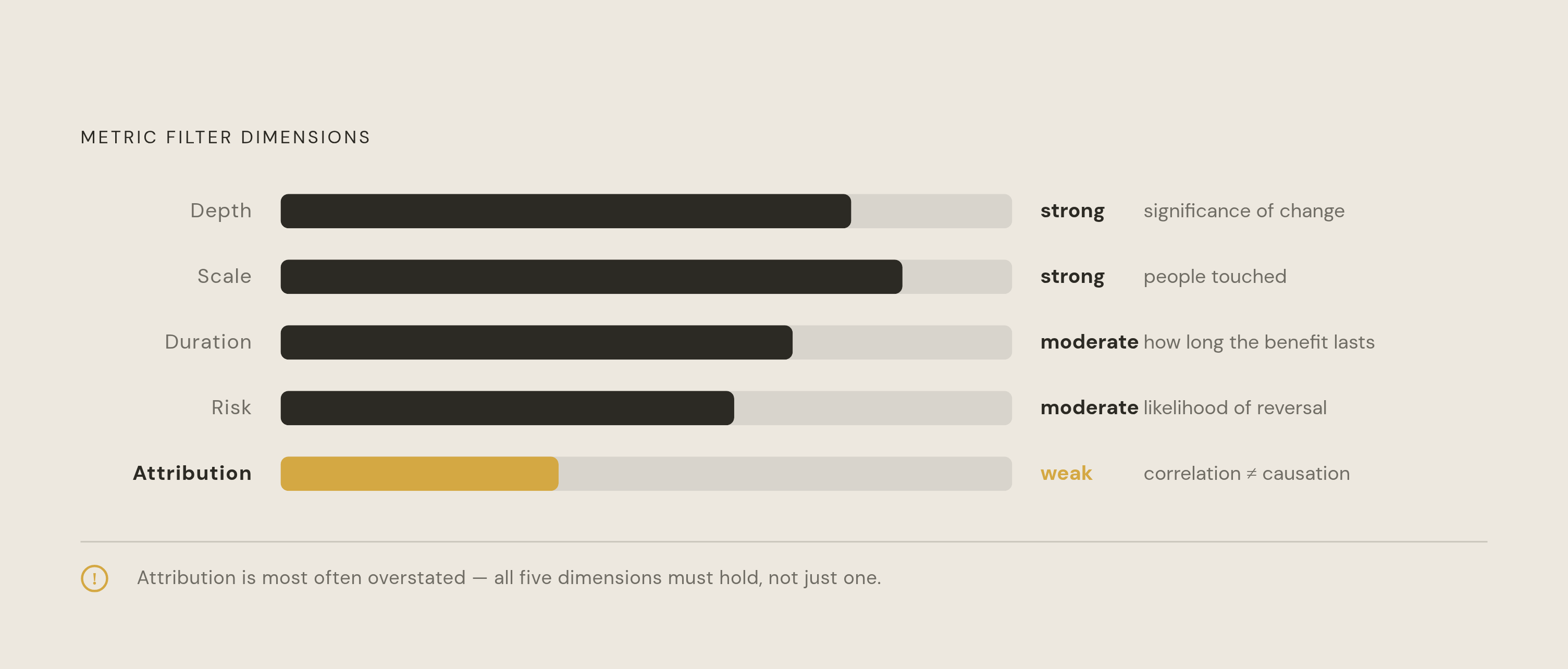
Not every measurable thing deserves to be measured. Five dimensions, drawn from established impact evaluation practice, filter candidates before they make it onto a dashboard.
Depth asks how significant the change actually is for the people or communities involved. Lifting a family out of extreme poverty scores high here, while more incremental changes tend to score lower on this dimension. Scale asks how many people are touched; a vaccination campaign reaching thousands clears that bar easily. Duration asks how long the benefit lasts, and a farming program that raises crop yields for years running demonstrates something a one-off training session simply cannot. Risk asks how likely the gains are to reverse: programs with real community ownership tend to carry lower risk of gains reversing. Attribution asks how much of the observed change can be tied directly to the intervention itself, as opposed to everything else happening in a person's life at the same time.
Attribution is the dimension most often overstated, and it deserves a blunt warning: correlation in program data is not demonstrated causation, no matter how clean the before-and-after numbers look. A program might reach a huge number of people, scoring high on scale, while the benefit fades within months, scoring low on duration. That combination should change how the results get framed to a funder or board. It should not get smoothed over in a summary slide.
Run every candidate metric through these five filters before locking in a measurement plan. Skipping this step, as most organizations do, produces a dashboard full of indicators that look impressive in a deck but say nothing about the program's actual effectiveness, a gap that becomes visible the moment a board member asks a question the dashboard can't answer.
A practical metric menu: common categories and examples organized by program type
No universal metrics list exists, and any framework claiming otherwise is oversimplifying the problem. The right measures depend on the program type, who it serves, and what change it's actually trying to produce. What follows are starting points to adapt.
Training and professional development programs typically track course completion against agreed requirements on the delivery side, and demonstrated skill use in practice on the outcome side. Membership and network programs look at how many member organizations actually participate in an activity, then follow up on whether people found the shared learning useful enough to apply. Employment support programs count participants who received a defined service, then track job starts, retention, and job quality at defined follow-up points after placement. Partner and supplier development work tracks how many partner sites completed agreed actions, then looks for evidence that a relevant practice actually stuck. Grant portfolios track how many grants have usable reporting attached, then aggregate program-specific outcomes only where the underlying definitions actually permit it, since averaging incompatible metrics produces nonsense. Community initiatives track the reach of an engagement or service, then assess relevant community conditions using methods suited to the question.
Five broader categories apply across most of these program types. Net results metrics are the direct outputs measured against set goals: volunteer hours logged, emissions reduced by percentage, initiatives funded. They're useful mainly for tracking change year over year, and not much else. Net Promoter Score, adapted for social programs, asks how likely a beneficiary is to recommend the program, and can surface promoters versus detractors within a specific community. Outreach metrics (social reach, site traffic, earned media) matter when amplification is itself part of the program's theory of change, not when it's a vanity add-on tacked on for the annual report. Inclusion and diversity metrics should measure power dynamics, representation, and participation by the groups the program actually targets, tied to the program's stated goals rather than a generic checklist copied from a competitor. Open feedback, interviews, open-ended survey responses, and personal accounts supply the qualitative texture that turns a spreadsheet into a story anyone outside the data team can follow.
Easy counts have a way of taking over a report simply because they're easy, and that's precisely why they need the most scrutiny, not the least. Output numbers give useful context, but they should never stand in for outcome evidence. Negative effects, exclusion, unintended burden, adverse experiences, shouldn't get cut just because they make the dashboard longer or the story less tidy. Cutting them is how a report becomes marketing instead of measurement.
Choosing a framework means matching it to the program's goals, the resources on hand, and who's actually going to read the results. Get the match wrong and the framework becomes theater: technically correct, practically decorative.
Theory of Change works as a visual map connecting activities to expected outcomes and, eventually, impact. It earns its place before a program launches, when the job is clarifying assumptions and deciding what to measure. For any organization new to structured impact work, this is the sensible starting point. Skipping it to jump straight into SROI calculations is a common and avoidable mistake.
Social Return on Investment calculates the net present value of outcomes divided by total investment. In one worked example, a program costing $50,000 and generating $87,000 in economic benefit produces an SROI ratio of 1.74. Starting in 2026, SEBI's BRSR Core framework requires "reasonable assurance" for social metrics, and SROI is positioned as the standard method for audit-ready compliance under that regime. It isn't cheap to do well. SROI calls for skilled analysts, extensive stakeholder consultation, and rigorous data collection, and smaller organizations without much evaluation capacity often struggle to produce results that hold up under scrutiny. SROI earns its keep when the job is making an investment case or meeting an external audit requirement. It's overkill for a program still trying to figure out what it's doing.
IRIS+, maintained by the Global Impact Investing Network, works differently. It's a standardized catalog of metrics organized by themes and the UN Sustainable Development Goals. Organizations pick metrics matching their goals and report using shared definitions, rather than building an evaluation methodology from scratch. IRIS+ hands practitioners a menu; SROI asks them to build the meal themselves. IRIS+ fits impact investors and social enterprises that need to compare data across a whole portfolio over time, and it's the wrong tool for anyone who needs a single, defensible investment-case number.
The B Impact Assessment covers governance, workers, community, environment, and customers in one scoring system, and a high enough score leads to B Corp certification. It suits organizations focused on internal culture and on signaling commitment to stakeholder capitalism broadly, more than on proving any one program's return. Treating a B Corp score as evidence of program-level impact is a category error, and a common one.
The UN SDGs aren't a measurement framework at all, but they give programs a widely recognized reference point for connecting outcomes to global development priorities, which helps when communicating to a broad public or to investors scanning for alignment. As a rough guide: reach for SROI or IRIS+ when talking to investors, Theory of Change when designing something new, B Impact Assessment when certification and culture are the goal, and SDG alignment when the audience is the public.
Building a measurement strategy that produces defensible claims, not just populated dashboards
A dashboard full of numbers isn't a defensible claim, and the gap between the two comes down to sequence.
Name the intended change and tie it to a theory of change, or some other reasoned account of the work, before picking a single metric. Then identify who's going to act on the finding and what they need to know to act on it. A board deciding whether to renew funding needs different evidence than a program manager deciding whether to adjust curriculum. Conflating those two audiences is how reports end up satisfying neither. Check relevance with the people affected, beneficiaries, funders, partners, because a convenient indicator can miss what actually matters to the people living the change.
Only then write the metric definition in full: population, observation rule, numerator, denominator, source, timing, limitations, and a named owner. Balance delivery data against outcome data so results can actually be interpreted, without letting easy counts crowd out the harder evidence. Weigh feasibility and burden honestly. Use decent existing data sources where they exist, and only collect what the team can realistically keep up with and actually use. Pilot the questions, the calculations, and the report format on a small cohort before scaling, and assign someone to own the review: who checks data quality, who interprets what it means, who writes down the next action.
Numbers alone rarely tell the whole story. A health initiative might pair hospital records with patient testimonials, since the records show scale and the testimonials show what the scale actually meant to someone. That mixed-methods approach is essential. It's what makes a report readable to someone outside the data team.
A measurement strategy that only lives inside the CSR team tends to collapse the moment HR, finance, or community partners need something it wasn't built to answer, and data silos remain a significant structural challenge in this work. Sharing both the wins and the setbacks openly, rather than curating only the flattering numbers, is what keeps the whole system credible over time. None of it is a one-time exercise, either. Findings should feed back into both the program and the measurement approach on a loop, because a metric that made sense last year can quietly stop measuring anything useful once the program changes shape.
Execution has its own toolkit, and none of it substitutes for the sequence above. Theory of Change guides design, SROI builds the investment case, surveys carry beneficiary feedback, and platforms like Tableau or Power BI turn the numbers into something a stakeholder can actually read. AI-driven platforms are increasingly used to accelerate reporting timelines, which raises the stakes on getting the underlying definitions right the first time, since speed just multiplies whatever's already baked into the metric. A short list of well-defined metrics beats a long one nearly every time, as long as the important negative effects don't get quietly dropped just to keep that list short.
Extending impact measurement into AI-powered reporting and visibility for agencies and brands
The rise of AI-powered search and answer engines has changed how this data gets consumed, and it's changed the reporting process itself, not just the distribution. A Morgan Stanley survey found that three in five investors won't invest without credible impact data, and that data now has to appear where investors and buyers actually look, which increasingly means AI-powered search and answer engines rather than a PDF sitting on a company website.
For agencies handling social impact reporting across a roster of client brands, this adds a layer of operational complexity on top of everything already covered here. Data collection has to stay consistent across clients, results have to be comparable where that's fair, and each client still needs a report that reads as theirs alone, not a template with the logo swapped out.
Platforms built specifically for agency-scale impact reporting, Thrad among them, give account teams one workspace to manage every brand in the portfolio, with cumulative analytics across all clients alongside granular control over which clients can log in and see their own data directly. Agency commercial structures rarely fit a single template, so billing needs to flex between centralized and per-client arrangements. Bespoke weekly reports and per-client data exports give account teams the concrete evidence needed to justify a retainer and keep an account, and the same rigor argued for at the program level throughout this piece applies just as much to the reporting layer itself.
AI visibility is becoming its own measurement category, and ignoring it is a mistake that will look obvious in hindsight. 89% of buyers in 2026 are reported to rely on generative AI tools when researching vendors, so a social impact story that doesn't appear in those AI-generated answers isn't reaching the audience most motivated to act on it. Organizations that do the hard work of rigorous impact measurement but neglect how that data gets structured for AI end up in a strange spot: real, well-documented credibility exists but stays invisible exactly where the decisions get made, because the AI-generated answer never includes it.
Sources
- Measuring social impact metrics: tools and techniques
- Social Impact Metrics: Examples, Definitions and How to Choose
- Social Impact measurement metrics - BOI (Board of Innovation)
- How Corporations Can Measure Social Impact
- Measuring Social Impact: Methods, Metrics & Examples
- Social Impact Measurement: A Guide for Corporate Leaders | Uncommon Giving
- groundswell.io